- Blotter Weekly
- Posts
- Introducing your own portfolio performance vs the market
Introducing your own portfolio performance vs the market
Introducing several new features at Blotter
Blotter.fyi
November 03, 2024
INTRODUCING YOUR PORTFOLIO VS THE MARKET
At Blotter, our goal is to transparency in the retail trading market. Towards that end, one of our core metrics that we is the S&P beat which compares a traders performance with a buy and hold strategy for the S&P 500.
Until now, we only had a single number and there was no way to dive into the performance of a user on a daily basis. We’re happy to share that we are now introducing portfolio performance which fills this gap. Let’s just see how it looks by going to the profile of any user.
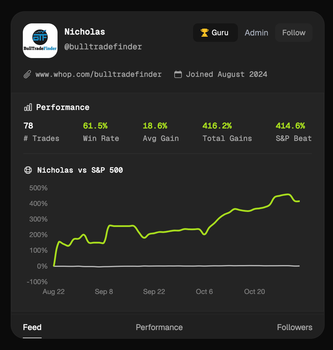
Portfolio performance (Green line) compared with S&P 500 (Gray line)
The green line above is the portfolio performance of one of our top users, while the gray line is the S&P buy and hold performance for the same period. If you think this number looks unrealistic, I highly recommend going over all the trades of this pro, to see for yourself.
PORTFOLIO PERFORMANCE & MORE UPDATES ARE COMING TO OUR APPS TOO
We’re also shipping these new features to both of our android and iOS apps. Make sure to look for updates over the next few days. Here is how it looks on the app. Pretty cool, right?

Portfolio performance in our apps
We’re also adding two more features to the apps.
Fund Holdings: You can now go to a symbol and see the top funds that are holding that company.
Default Quantity: When submitting a trade, if you set a quantity, that is used as a default quantity from then onwards.
Please do wait for a day or two until the new updates are shipped to the app stores. You’ll start to see them sometime mid week on your apps.
THANK YOU, THANK YOU
As always, thank you for reading and using our platform. I will try my best to always keep this section here, since I really am grateful to all of you.